|
click here to maximize your minimalism!
click here
click here
click here

click here to view my favorites from the archives. gee


are you a fonts enthusiast? a typophile?
read more

find the beauty on your daily walk! take time to notice the details of your landscape.
read more

there is nothing like seeing a great handbag in action.
read more

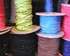
plastics are our future. how can you resist plastic? it is so shiny and pleasing. I have a penchant for plastics.
read more

chronicling my quest for the one true
Greek Cup
read more

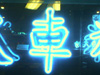
have you ever noticed the similarity between nyc fire call boxes and benevolent Kannon, goddess of mercy?
read more

every design, fashion and art magazine I read lately features some important directional artist making big contributions to their genre. and where do they live? brooklyn!
read more

who says there are no more 'new ideas' in art and design? the newness is in the juxtaposition.
read more

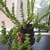
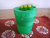
this is how I really get things done. with my little green co-worker/task-master.
read more
my
clothing & accessories design
east-meets-west minimalism
my site
elaineperlov.com
the look
dressy utilitarian
my concept
useful, economical, modular pieces that can be mix-matched in numerous
ways (because why can't fashion be useful and lasting? I think
it can!) So I say Maximize your Minimalism!
Satin Karate Belt featured in Dec 06 Real Simple

Voted Best Designer 2006 Style Bakery
'On the Rise'
Awards

Daily Buss Feature

Luckymag.com Feature
in the blog press
midtown lunch
brownstoner
racked
coutorture
the girl who ate everything
coutorture
queens eats
(into) the fray
stylefinds
funky finds
style document
stylefinds
gowanus lounge
far too cute
modish
ethereal bliss
couture in the city
independent luxe
decor 8
funky finds
urban socialite
lady licorice
high fashion girl
more press...
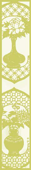
inspiration
furniture (especially chairs from the 50s and 60s), uniforms, repeating patterns, menswear, Oscar Niemeyer,
traditional Japanese architecture, the Rimpa School and Ogata Korin's 8-Point Bridge, Matisse, bromeliads,
succulents and other waxy flora
particular loves
bamboo, coral, moss, woodgrain, silhouettes & other cut-outs, plastic,
low-resolution images, the photo copier, off-registration prints, Max
Ernst's Lunar Asparagus, NYC fire call boxes that look like Kannon, Fauvist color sense, the Noguchi Museum,
pretty much all of Abstract Expressionism
magazines of current
interest
Domino, Elle Decor (British), ARTnews, Art in America, Wallpaper
favorite heel style
the wedge, but a sleek modern interpretation
second favorite
the stiletto
current shoe obsession
alas, the sneaker. (because I live in nyc and walk a ton!) but not too
sneakery of a sneaker. more of a sneaker disguised as a shoe, like a mary
jane style or a high-tech looking black one with a metallic accent. how
about Royal Elastics? I must go try some on. I really like the non-sneakeryness
of their styles.


|
jack pierson vs. barneys
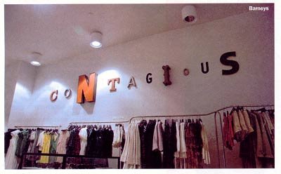 One of the faked Piersons in Barneys, photo from TimeOut One of the faked Piersons in Barneys, photo from TimeOut I just read in TimeOut this morning about the legal battle between artist Jack Pierson (or really the gallery who represents him, Cheim & Read) and Barneys (namely the Creative Director, Simon Doonan, who claims to have never heard of Jack Pierson, and that the store's visual displays that directly copy the artist's word sculptures are purely coincidence). For more of the story check out page 10 of this week's magazine. Or read this blog entry by Edward Winkleman. I too thought they were real Jack Piersons when I was in the store. My favorite part is that the party doing the knocking-off gets discounted in the public eye. Cheim & Read sent out a press release that included the following: "Around a year or so ago, imitations or forgeries of these works began to appear in Barneys clothing stores throughout the country saying such things as 'fabulous, courageous, and outrageous.' They are formally weak plagiarized versions of Jack Pierson's work, and we want you to know that they are not by Jack Pierson." Cheim concluded: "We regret this lack of integrity on the part of... Barneys. They obviously have no respect for artists or the art world." (source: NY Daily News)
Go Cheim & Read!
Labels: contemporary art
:::
|
|
 One of the faked Piersons in Barneys, photo from TimeOut


4 Comments:
beautiful camera phone pictures!
anastasia beaverhausen
howtowearclothes.blogspot.com
Pierson did not invent the technique of cobbled-together signs, so I don't think you can assume that the signs in Barney's are even a concious rip-off of his works.
Cheim & Read created a P.R. stunt. The signs in Barney's have been on display for 2 years. Why start a fuss over nothing now?
Thanks for the good comment. Keep them coming!
I work in an ad agency and can uncategorically say that this "look" has been around at least since the 1960's, where different font styles are used in a singular word or sentence.
There is nothing new, creative nor infringing-upon-the-creative-of-others about it.
In fact, the artist pressing the lawsuit might want to reconsider before someone sues him for ripping off THEIR version...
Post a Comment
<< Home