|
click here to maximize your minimalism!
click here
click here
click here

click here to view my favorites from the archives. gee


are you a fonts enthusiast? a typophile?
read more

find the beauty on your daily walk! take time to notice the details of your landscape.
read more

there is nothing like seeing a great handbag in action.
read more

plastics are our future. how can you resist plastic? it is so shiny and pleasing. I have a penchant for plastics.
read more

chronicling my quest for the one true
Greek Cup
read more

have you ever noticed the similarity between nyc fire call boxes and benevolent Kannon, goddess of mercy?
read more

every design, fashion and art magazine I read lately features some important directional artist making big contributions to their genre. and where do they live? brooklyn!
read more

who says there are no more 'new ideas' in art and design? the newness is in the juxtaposition.
read more

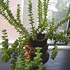
this is how I really get things done. with my little green co-worker/task-master.
read more


my
clothing & accessories design
east-meets-west minimalism
my site
elaineperlov.com
the look
dressy utilitarian
my concept
useful, economical, modular pieces that can be mix-matched in numerous
ways (because why can't fashion be useful and lasting? I think
it can!) So I say Maximize your Minimalism!
Satin Karate Belt featured in Dec 06 Real Simple

Voted Best Designer 2006 Style Bakery
'On the Rise'
Awards

Daily Buss Feature
Luckymag.com Feature

in the blog press
midtown lunch
brownstoner
racked
coutorture
the girl who ate everything
coutorture
queens eats
(into) the fray
stylefinds
funky finds
style document
stylefinds
gowanus lounge
far too cute
modish
ethereal bliss
couture in the city
independent luxe
decor 8
funky finds
urban socialite
lady licorice
high fashion girl
more press...
inspiration
furniture (especially chairs from the 50s and 60s), uniforms, repeating patterns, menswear, Oscar Niemeyer,
traditional Japanese architecture, the Rimpa School and Ogata Korin's 8-Point Bridge, Matisse, bromeliads,
succulents and other waxy flora
particular loves
bamboo, coral, moss, woodgrain, silhouettes & other cut-outs, plastic,
low-resolution images, the photo copier, off-registration prints, Max
Ernst's Lunar Asparagus, NYC fire call boxes that look like Kannon, Fauvist color sense, the Noguchi Museum,
pretty much all of Abstract Expressionism
magazines of current
interest
Domino, Elle Decor (British), ARTnews, Art in America, Wallpaper
favorite heel style
the wedge, but a sleek modern interpretation
second favorite
the stiletto
current shoe obsession
alas, the sneaker. (because I live in nyc and walk a ton!) but not too
sneakery of a sneaker. more of a sneaker disguised as a shoe, like a mary
jane style or a high-tech looking black one with a metallic accent. how
about Royal Elastics? I must go try some on. I really like the non-sneakeryness
of their styles.




|
framing elements: the new index page
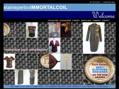 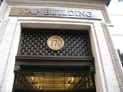 I wanted to show you the reference photo I used to make the new index page: Transition into Fall 2006! The wrought iron openwork at 171 Madison Avenue caught my eye because I love repeating geometric patterns. Here were the 3 photos I took back in early Spring. That turned out to be a very good walk! (see also the Geisha/StyleBakery index page from April, using the top photo) In Photoshop, I took a thumbnail-sized sample of the wrought iron and repeated it like building blocks across the page. I love how the 'seams' meet on all four sides. Matching, but not quite matching. I think in terms of 'seams' and juxtapositions. What can I say? 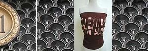 I liked how the color and pattern of the wrought iron complemented the rich browns, golds, pinks and plums of the SUMI-E and BAMBOO pieces, and the texture of the LABYRINTH OBI. As I have been doing for the last few index pages, I inserted thumbnails and details of my designs into the 'building facade' to make the various tops and skirts look like building blocks themselves -- wardrobe building blocks that you can use to create many economical outfit combinations. All it takes is a few new building blocks each season to see your old favorites in a new way. As we enter a new clothing season, it is always nice to recontextualize and reframe your existing wardrobe. Choose a new basic, a new color, a new texture, and a new accessory. Break up that suit into separates or add a new top and necklace underneath. Add a new wide OBI to 'an old faithful' ensemble you loved from last Fall. See things in a new context. It is a brand new season to create a new you! And all it takes are just a few new modular elements. Modular Dressing is a new featured regular column for the blog. gee
Click here for a more in-depth read about my concept and economical approach to fashion.Labels: architecture, design, modular dressing
:::
|
|




1 Comments:
Hey Elaine--
I worked in that building for 3 years!
-diana
Post a Comment
<< Home