|
click here to maximize your minimalism!
click here
click here
click here

click here to view my favorites from the archives. gee


are you a fonts enthusiast? a typophile?
read more

find the beauty on your daily walk! take time to notice the details of your landscape.
read more

there is nothing like seeing a great handbag in action.
read more

plastics are our future. how can you resist plastic? it is so shiny and pleasing. I have a penchant for plastics.
read more

chronicling my quest for the one true
Greek Cup
read more

have you ever noticed the similarity between nyc fire call boxes and benevolent Kannon, goddess of mercy?
read more

every design, fashion and art magazine I read lately features some important directional artist making big contributions to their genre. and where do they live? brooklyn!
read more

who says there are no more 'new ideas' in art and design? the newness is in the juxtaposition.
read more

this is how I really get things done. with my little green co-worker/task-master.
read more


my
clothing & accessories design
east-meets-west minimalism
my site
elaineperlov.com
the look
dressy utilitarian
my concept
useful, economical, modular pieces that can be mix-matched in numerous
ways (because why can't fashion be useful and lasting? I think
it can!) So I say Maximize your Minimalism!
Satin Karate Belt featured in Dec 06 Real Simple

Voted Best Designer 2006 Style Bakery
'On the Rise'
Awards

Daily Buss Feature
Luckymag.com Feature

in the blog press
midtown lunch
brownstoner
racked
coutorture
the girl who ate everything
coutorture
queens eats
(into) the fray
stylefinds
funky finds
style document
stylefinds
gowanus lounge
far too cute
modish
ethereal bliss
couture in the city
independent luxe
decor 8
funky finds
urban socialite
lady licorice
high fashion girl
more press...
inspiration
furniture (especially chairs from the 50s and 60s), uniforms, repeating patterns, menswear, Oscar Niemeyer,
traditional Japanese architecture, the Rimpa School and Ogata Korin's 8-Point Bridge, Matisse, bromeliads,
succulents and other waxy flora
particular loves
bamboo, coral, moss, woodgrain, silhouettes & other cut-outs, plastic,
low-resolution images, the photo copier, off-registration prints, Max
Ernst's Lunar Asparagus, NYC fire call boxes that look like Kannon, Fauvist color sense, the Noguchi Museum,
pretty much all of Abstract Expressionism
magazines of current
interest
Domino, Elle Decor (British), ARTnews, Art in America, Wallpaper
favorite heel style
the wedge, but a sleek modern interpretation
second favorite
the stiletto
current shoe obsession
alas, the sneaker. (because I live in nyc and walk a ton!) but not too
sneakery of a sneaker. more of a sneaker disguised as a shoe, like a mary
jane style or a high-tech looking black one with a metallic accent. how
about Royal Elastics? I must go try some on. I really like the non-sneakeryness
of their styles.




|
musings on the designer portrait
 I don't know about you, but when it comes to websites, I like to keep the photos of myself small and blurry, in the interest of putting the focus on the pieces I design, instead of me. I like to use small and blurry cellphone photos of myself. There is something to be said for low-resolution. Or the Japanese sticker booth pictures. Those are even smaller! Like the one on my ABOUT US page. Now I have to come up with a good clear photo, however, for www.brooklynindiemarket.com. What to do. 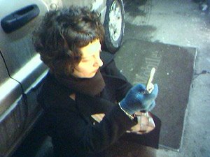 Hey, could I use this one? I like this one. It shows me taking a photo with my new cellphone camera. 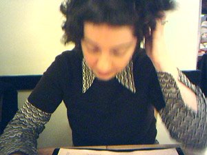 Or how about this one? Me deeply contemplating the menu in a hand-drawn noodle restaurant. The one at the top is me eating the hand-drawn noodles with a big grin. 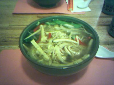 And just for your reference, here are the hand-drawn noodles. Hey can I use this for my designer portrait?
:::
|
|

 Hey, could I use this one? I like this one.
 Or how about this one?
 And just for your reference,





3 Comments:
I must protest! We, the viewing public, would prefer a clear shot of your face to a clear shot of clear broth.
I thought as much. But you say this looking at my blurry photo wanting more. Isn't that what fashion is all about, wanting more? So haven't I succeeded with my blurry one? I know, I'll find a clear one.
i dont have anything against blurry photos. not any photo is good only for being clear, and not any photo is bad only for being blurry.
i like the 3rd one the best. :)
your shoulders arent blurry, thats a good compromise. :D
Post a Comment
<< Home