


I was basking in the glow of our clean apartment this morning, looking around happily, sipping my coffee, when I decided to check my email. I found out from my friend Megan that Apartment Therapy's annual contest for the Smallest Coolest Apartment 2007 is on again. I decided to photograph our apartment to see how it stacked up to the applicants'. For some reason, my decluttered minimalist apartment looked cluttered in my first batch of photos. There was some unpleasant 'compression of space' going on. After studying some of the more successful shots on Apartment Therapy, I picked up some new tricks. Here is what I observed:
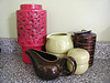
 Alterations for the photo: tip #2. I used champagne glasses. Why not.
I love to see how other people live, decor-wise. The Apartment Therapy contest is such a great idea. Below, some photos I took of our living room after studying and making slight adjustments. Try photographing your place. It's kind of fun.
 I used compositional technique, tip #1: foregrounded yellow lamp.
Alterations for the photo: none.
(oops, forgot to remove the dangling extension cord behind the
Eames chair. You notice these things more in photographs
than you do in 'real life.')
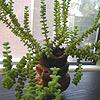
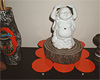
 tip #1 & tip #2: that plant in the red pot is normally in the kitchen,
and there is normally a stack of books where the plant is.
The magazine stack above the yellow lamp in 'real life' is also much taller.
 I used compositional technique, tip #4: a slightly 'aerial' view.
 Alterations for the photo: tip #2. I used champagne glasses. Why not.
- Place an item of interest in the foreground like Anusha's Modern Merge (#24) or Ron's Hotel Sweet (#40).
- Set the scene with candles, plants or glassware like 42Anderson's Love, Eat, Party (#22) or Fernanda & Adam's Hidden Storage (#23).
- Don't shoot anything straight on without the hint of a second wall. It looks too lonely and stark like Nick's Lucid Lucite and Clinical Creativity (#32), first picture. Of course, it always helps the photo to have darker, more defining colors on the walls, like Olivia Leigh's Limited Time (#10). I love this one.
- Aerial views can be effective too, like Manuel's Houston Cottage (#12) or Billy's East Bay (#20).
I love to see how other people live, decor-wise. The Apartment Therapy contest is such a great idea. Below, some photos I took of our living room after studying and making slight adjustments. Try photographing your place. It's kind of fun.
 I used compositional technique, tip #1: foregrounded yellow lamp.
Alterations for the photo: none.
(oops, forgot to remove the dangling extension cord behind the
Eames chair. You notice these things more in photographs
than you do in 'real life.')
 tip #1 & tip #2: that plant in the red pot is normally in the kitchen,
and there is normally a stack of books where the plant is.
The magazine stack above the yellow lamp in 'real life' is also much taller.
 I used compositional technique, tip #4: a slightly 'aerial' view.
Labels: apartment, apartment therapy, design, home accessories, interior design


2 Comments:
Apartment Therapy is from heaven. I love that site. And I love your place - great style.
Fab! I particularly like the bookcase/divider wall, because it's dual purpose, and the step formation, so it's not dull.
Post a Comment
<< Home