
click here to view my favorites from the archives. gee















read more

read more

read more

read more

Greek Cup
read more

read more

read more

read more

read more
my
clothing & accessories design
east-meets-west minimalism
my site
elaineperlov.com
the look
dressy utilitarian
my concept
useful, economical, modular pieces that can be mix-matched in numerous
ways (because why can't fashion be useful and lasting? I think
it can!) So I say Maximize your Minimalism!
Satin Karate Belt featured in Dec 06 Real Simple

Voted Best Designer 2006 Style Bakery
'On the Rise'
Awards

in the blog press
midtown lunch
brownstoner
racked
coutorture
the girl who ate everything
coutorture
queens eats
(into) the fray
stylefinds
funky finds
style document
stylefinds
gowanus lounge
far too cute
modish
ethereal bliss
couture in the city
independent luxe
decor 8
funky finds
urban socialite
lady licorice
high fashion girl
inspiration
furniture (especially chairs from the 50s and 60s), uniforms, repeating patterns, menswear, Oscar Niemeyer,
traditional Japanese architecture, the Rimpa School and Ogata Korin's 8-Point Bridge, Matisse, bromeliads,
succulents and other waxy flora
particular loves
bamboo, coral, moss, woodgrain, silhouettes & other cut-outs, plastic,
low-resolution images, the photo copier, off-registration prints, Max
Ernst's Lunar Asparagus, NYC fire call boxes that look like Kannon, Fauvist color sense, the Noguchi Museum,
pretty much all of Abstract Expressionism
magazines of current
interest
Domino, Elle Decor (British), ARTnews, Art in America, Wallpaper
favorite heel style
the wedge, but a sleek modern interpretation
second favorite
the stiletto
current shoe obsession
alas, the sneaker. (because I live in nyc and walk a ton!) but not too
sneakery of a sneaker. more of a sneaker disguised as a shoe, like a mary
jane style or a high-tech looking black one with a metallic accent. how
about Royal Elastics? I must go try some on. I really like the non-sneakeryness
of their styles.

10.05.2014
yup, also fontastic

posted by Elaine Perlov at
2:15 PM
0 Comments


 |
 |
 |
 |
 |
|
:::
10.20.2011
full of wonder

posted by Elaine Perlov at
12:22 PM
2 Comments
|
|
|
|
|
|
:::
1.08.2011
after a movie, there should be pie
 Brooklyn Academy of Music
 BAM, in downtown Brooklyn near the clock tower. Totally iconic.
 They don't make signs like this anymore. Fontastic!
 Now doesn't that look gorgeous? I love that this photo is time stamped.
I've been wanting to go to Junior's for five and a half years now, basically since we moved to Brooklyn. I'm not really a cheesecake fan, but really, Junior's is iconic. I was content with having a cup of coffee at the counter. Did they even have a counter? They must have a counter. (I looked it up online. They have a counter.)
So after we went to see a movie at BAM (another favorite iconic Brooklyn location of mine), we struck out for the Flatbush Avenue Extension (which I finally looked up on a map. All these years of hoping to happen upon Junior's on Flatbush Avenue did not prove fruitful. It never turned up.) And do you know what? It was my most favorite thing we have done lately!
The maitre d' was dressed in a suit. We sat at the horseshoe counter, and he immediately handed us menus. When does immediate acknowledgment happen in a New York restaurant? Our waiter was also dressed impeccably in a white shirt, black bow tie and vest. All of this proper service was straight out of another era. And it made our experience at Junior's so memorable. I cannot wait to go back.
We were just going to get coffee, but then we spied the mile-high lemon meringue pies in the window. So after three refills of coffee, we got a piece of pie to share. Look at this portion! Bottomless coffee was only $1.95 and this massive piece of pie (1/4 of a whole pie, in fact) dotted with the most delicious crumbs, was just $5.95. I think we tipped our waiter $10. He was great, and thanks to him, we had a great time.
 Great logo, great orange stripes.
 Yes, Junior's has a counter.
 I love the milk pitcher. It's like a spaceship.
 Would you look at this piece of lemon meringue pie!
Just look at it!
Labels: brooklyn, coffee, design, fonts, restaurants, sweets
 Brooklyn Academy of Music
 BAM, in downtown Brooklyn near the clock tower. Totally iconic.
 They don't make signs like this anymore. Fontastic!
 Now doesn't that look gorgeous? I love that this photo is time stamped.
I've been wanting to go to Junior's for five and a half years now, basically since we moved to Brooklyn. I'm not really a cheesecake fan, but really, Junior's is iconic. I was content with having a cup of coffee at the counter. Did they even have a counter? They must have a counter. (I looked it up online. They have a counter.)
So after we went to see a movie at BAM (another favorite iconic Brooklyn location of mine), we struck out for the Flatbush Avenue Extension (which I finally looked up on a map. All these years of hoping to happen upon Junior's on Flatbush Avenue did not prove fruitful. It never turned up.) And do you know what? It was my most favorite thing we have done lately!
The maitre d' was dressed in a suit. We sat at the horseshoe counter, and he immediately handed us menus. When does immediate acknowledgment happen in a New York restaurant? Our waiter was also dressed impeccably in a white shirt, black bow tie and vest. All of this proper service was straight out of another era. And it made our experience at Junior's so memorable. I cannot wait to go back.
We were just going to get coffee, but then we spied the mile-high lemon meringue pies in the window. So after three refills of coffee, we got a piece of pie to share. Look at this portion! Bottomless coffee was only $1.95 and this massive piece of pie (1/4 of a whole pie, in fact) dotted with the most delicious crumbs, was just $5.95. I think we tipped our waiter $10. He was great, and thanks to him, we had a great time.
 Great logo, great orange stripes.
 Yes, Junior's has a counter.
 I love the milk pitcher. It's like a spaceship.
 Would you look at this piece of lemon meringue pie!
Just look at it!
Labels: brooklyn, coffee, design, fonts, restaurants, sweets
posted by Elaine Perlov at
7:50 PM
0 Comments
|
|
|
|
|
|
:::
8.18.2010
simply fontastic!
 Tell me this doesn't look like lips and teeth?
 All images from the same building in Old City, Philadelphia
I love the decay on these letters. LETTERS and USED should both become fonts, for sure.
While I'm at it, I'm throwing in an escutcheon for good measure. Because who doesn't love a good escutcheon?

Labels: art in the everyday, escutcheon, fonts
 Tell me this doesn't look like lips and teeth?
 All images from the same building in Old City, Philadelphia
While I'm at it, I'm throwing in an escutcheon for good measure. Because who doesn't love a good escutcheon?

Labels: art in the everyday, escutcheon, fonts
posted by Elaine Perlov at
8:31 AM
0 Comments
|
|
|
|
|
|
:::
10.01.2009
i think the line goes, if i 'were' a rich girl
 Watch Gwen Stefani's Rich Girl video here.
Yes, grammatically this bothers me.
It really should be, "If I 'were' a rich girl"
You know, the conditional tense? But please read on.
I haven't listened to Gwen Stefani in awhile, but I have to write a lot of product copy at the moment, and I find it good background work music. I always get a lot done while listening to her music for some reason. Good beat? High energy? I don't know why. Anyway, I am watching the video for Rich Girl and I am amazed. It is so merchandisey. I mean, I can just see all the products spinning off from this video. I think Gwen Stefani, the fashion empire, not the person, wants to create desire in little girls to shop, and buy her products when they grow up. Or something.
Love Angel Music Baby
Hurry up and compensate me
Indeed. There's an interesting John Galliano-style fashion interlude. Hey, I just realized L.A.M.B. is the poor girl's John Galliano. Look at his font. It's the same as L.A.M.B.'s. Well, that's brilliant of them.
Think would that money could bring
I'd buy anything
Clean out Vivienne Westwood in my Galliano gown.
Compare and contrast, if you will:
Labels: fashion, fonts, something about shopping
Watch Gwen Stefani's Rich Girl video here. Yes, grammatically this bothers me.
It really should be, "If I 'were' a rich girl"
You know, the conditional tense? But please read on.
Love Angel Music BabyIndeed. There's an interesting John Galliano-style fashion interlude. Hey, I just realized L.A.M.B. is the poor girl's John Galliano. Look at his font. It's the same as L.A.M.B.'s. Well, that's brilliant of them.
Hurry up and compensate me
Think would that money could bring
I'd buy anything
Clean out Vivienne Westwood in my Galliano gown.
Compare and contrast, if you will:


Labels: fashion, fonts, something about shopping
posted by Elaine Perlov at
11:12 AM
0 Comments
|
|
|
|
|
|
:::
7.08.2009
the new cooper union

Of course the signage is by Pentagram. Who else? Extremely fontastic in my opinion.
The new Cooper Union building is in the East Village on First Avenue. Have you seen it yet? I kinda like it a lot. Watch it being built here. I think you have to work to FF and the Rewind buttons in the left margin.Labels: architecture, design, fonts

Of course the signage is by Pentagram. Who else? Extremely fontastic in my opinion.
The new Cooper Union building is in the East Village on First Avenue. Have you seen it yet? I kinda like it a lot. Watch it being built here. I think you have to work to FF and the Rewind buttons in the left margin.
Labels: architecture, design, fonts
posted by Elaine Perlov at
2:51 PM
0 Comments
|
|
|
|
|
|
:::
5.21.2009
rare device
Did you know that Rare Device moved to San Francisco and started doing gallery shows? Where have I been? By the way, this invitation is also pretty fontastic.

Did you know that Rare Device moved to San Francisco and started doing gallery shows? Where have I been? By the way, this invitation is also pretty fontastic.
posted by Elaine Perlov at
12:05 PM
0 Comments
|
|
|
|
|
|
:::
4.27.2009
hedi slimane on uo?
Check out these amazing photographs by Hedi Slimane on, of all places, the Urban Outfitters blog. Yes, I would say that this is pretty fontastic.Labels: fonts

Labels: fonts
posted by Elaine Perlov at
5:05 PM
0 Comments
|
|
|
|
|
|
:::
12.02.2008
simply fontastique
Normally I would say that this M is simply fontastic, but as it was found on the streets of Paris (by Deb of Bonbon Oiseau), I must say that it is simply fontastique. N'est pas?Labels: fonts

Labels: fonts
posted by Elaine Perlov at
4:33 PM
1 Comments
|
|
|
|
|
|
:::
10.23.2008
gee and gee (no relation)

For obvious reasons, I rather like the name of this store. And such a nice return policy, spelled out right on the marquis. So really, how can you go wrong at Gee & Gee? I would say it is pretty fontastic, all in all.Labels: fonts, retail design

For obvious reasons, I rather like the name of this store. And such a nice return policy, spelled out right on the marquis. So really, how can you go wrong at Gee & Gee? I would say it is pretty fontastic, all in all.
Labels: fonts, retail design
posted by Elaine Perlov at
1:50 PM
1 Comments
|
|
|
|
|
|
:::
8.29.2008
shopping opp: victory ford's new store
 The retail space in question.
Some weeks ago, I got excited that a new store was finally going to open in a cavernous vacant retail space on Greenpoint Avenue. And then I got worried. Oh no, what if it is a West Elm? I don't mind West Elm. But not in my neighborhood. I want to keep my neighborhood chain-less. It's not exactly chain-less. We have a *$&@bucks. But perhaps we will luck out and our *$&@bucks will be one of the 600 to be shut down. Well, one can hope.
But back to the retail space in question. I have a suspicion that the fashion designer on Lipstick Jungle will open her own retail store this season. Walking home from the super-fab event I attended earlier last week, I spied the window decals bearing the name Victory Ford in a boxy semaphore-like font. Perhaps her store will be set on Cape Cod or the Hamptons. Or the West Village. Just know this. Victory Ford's fabulous store is acutally on Greenpoint Avenue in Greenpoint, a few doors upwind from a very aromatic chicken slaughtering plant. Oh well. Sorry to debunk your fashion fantasies.
 My first sneak-peak at the Victory Ford store, Monday evening, August 18, 2008
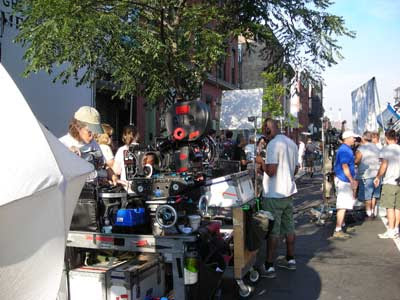 The Lipstick Jungle shoot the next morning after my discovery.
 The Victory Ford semaphore font changed color from the previous night. How?
They even built planters and trellises, which look very West Village.
 In the light blue shirt with headphones around his neck, Andrew McCarthy,
perhaps ,making is directorial debut for this episode.

Labels: celebrity, fashion, fonts, greenpoint, lipstick jungle, shopping
 The retail space in question.
Some weeks ago, I got excited that a new store was finally going to open in a cavernous vacant retail space on Greenpoint Avenue. And then I got worried. Oh no, what if it is a West Elm? I don't mind West Elm. But not in my neighborhood. I want to keep my neighborhood chain-less. It's not exactly chain-less. We have a *$&@bucks. But perhaps we will luck out and our *$&@bucks will be one of the 600 to be shut down. Well, one can hope.
 My first sneak-peak at the Victory Ford store, Monday evening, August 18, 2008
 The Lipstick Jungle shoot the next morning after my discovery.
 The Victory Ford semaphore font changed color from the previous night. How?
 They even built planters and trellises, which look very West Village.
 In the light blue shirt with headphones around his neck, Andrew McCarthy,
perhaps ,making is directorial debut for this episode.

Labels: celebrity, fashion, fonts, greenpoint, lipstick jungle, shopping
posted by Elaine Perlov at
2:45 PM
1 Comments
|
|
|
|
|
|
:::
8.06.2008
neon text widget: possibly fontastic
provided by: www.glittertools.com
If this works the way I think it works, you can enter text and convert it to a neon font with this widget. I'll have to do a little figuring to get this to work.
provided by: www.glittertools.com
Okay, I figured it out. You have to go to this link to enter text, play with backgrounds, control glow, blink speed and size. Pretty neat. If you want the full interactive tool on your blog, you have to pay. Otherwise, display your results for free by copying the code, and make your font posters here. I would rate this one fairly fontastic.Labels: fonts, neon signs
provided by: www.glittertools.com
provided by: www.glittertools.com
Labels: fonts, neon signs
posted by Elaine Perlov at
11:20 AM
2 Comments
|
|
|
|
|
|
:::
11.30.2007
fontastic on 53rd street


Since the Lever House font is the font that started my Fontastic! series on the blog, it surely deserves an inclusion here. Remember when the Lever House used to have this site-specific painting? I loved walking under that painting. Why did it have to be painted out? Yes, temporary art is beautiful, but I wish it would just become permanent. Read more about what it was and why it's gone.
 The Lever House in March 2007. This site-specific painting, Robert Towne,
by Sarah Morris was on view from September 12, 2006-March 12, 2007.
I happened to be walking by the day they were painting it.
That was pretty neat. I really loved this painting.
Labels: 53rd street, fonts, lever house, midtown, modernism


Since the Lever House font is the font that started my Fontastic! series on the blog, it surely deserves an inclusion here. Remember when the Lever House used to have this site-specific painting? I loved walking under that painting. Why did it have to be painted out? Yes, temporary art is beautiful, but I wish it would just become permanent. Read more about what it was and why it's gone.
 The Lever House in March 2007. This site-specific painting, Robert Towne,
 by Sarah Morris was on view from September 12, 2006-March 12, 2007.
I happened to be walking by the day they were painting it.
That was pretty neat. I really loved this painting.
Labels: 53rd street, fonts, lever house, midtown, modernism
posted by Elaine Perlov at
10:38 PM
0 Comments
|
|
|
|
|
|
:::
10.04.2007
fontastic in philly


What do I like about this font at the Philadelphia Savings Fund Society Building on Market and 12th Streets, now the Loews Philadelphia Hotel since 2000? The rounded smoothness. Just look at the beautiful '8.' And the depth of the letters. They cast quite a shadow.
The PSFS by architects George Howe and William Lescaze was completed in 1932 and is noted for being the first truly modern skyscraper in Philadelphia, complete with an escalator in the lobby. Created in the International Style, this converted 36-floor office building is wonderfully unique hotel experience in the heart of the city. It was a thrill to stay in this historic landmark a few years ago. And the pool! The pool was fabulous. Here is a bit more about the ground-breaking design of the PSFS Building from AbsoluteArts.com:
The second section will demonstrate how every aspect of the building, from its red neon rooftop sign to its Cartier clocks, was designed by the architects as a seamless work of art. Beyond its progressive architecture, the building was heralded for other pioneering elements, some of which would become standard features of post-World War II commercial buildings. Among these innovations are street-level shops, the use of an escalator as a primary means of entrance, radio outlets in every office, nearby garage facilities, high-rise elevators, thermostatically controlled heat and a rooftop observation platform. Perhaps the most noteworthy advance of all was the use of air conditioning, which ranked PSFS the second tallest building in America to be climate controlled. This section of the exhibition will also display photography and Modernist graphic designs created to promote the building at its opening.
Labels: architecture, design, fonts, hotels, loews philadelphia hotel, philadelphia, psfs


What do I like about this font at the Philadelphia Savings Fund Society Building on Market and 12th Streets, now the Loews Philadelphia Hotel since 2000? The rounded smoothness. Just look at the beautiful '8.' And the depth of the letters. They cast quite a shadow.
The PSFS by architects George Howe and William Lescaze was completed in 1932 and is noted for being the first truly modern skyscraper in Philadelphia, complete with an escalator in the lobby. Created in the International Style, this converted 36-floor office building is wonderfully unique hotel experience in the heart of the city. It was a thrill to stay in this historic landmark a few years ago. And the pool! The pool was fabulous. Here is a bit more about the ground-breaking design of the PSFS Building from AbsoluteArts.com:
The second section will demonstrate how every aspect of the building, from its red neon rooftop sign to its Cartier clocks, was designed by the architects as a seamless work of art. Beyond its progressive architecture, the building was heralded for other pioneering elements, some of which would become standard features of post-World War II commercial buildings. Among these innovations are street-level shops, the use of an escalator as a primary means of entrance, radio outlets in every office, nearby garage facilities, high-rise elevators, thermostatically controlled heat and a rooftop observation platform. Perhaps the most noteworthy advance of all was the use of air conditioning, which ranked PSFS the second tallest building in America to be climate controlled. This section of the exhibition will also display photography and Modernist graphic designs created to promote the building at its opening.
Labels: architecture, design, fonts, hotels, loews philadelphia hotel, philadelphia, psfs
posted by Elaine Perlov at
11:00 AM
0 Comments
|
|
|
|
|
|
:::
8.30.2007
fontastic on Park Avenue

posted by Elaine Perlov at
11:52 AM
0 Comments
|
|
|
|
|
|
:::
8.24.2007
vong is fontastic too

Jean-Georges Vongerichten's establishment on 54th Street. Vong is pretty fontastic.Labels: 54th street, design, fonts, midtown, restaurants

Jean-Georges Vongerichten's establishment on 54th Street. Vong is pretty fontastic.
Labels: 54th street, design, fonts, midtown, restaurants
posted by Elaine Perlov at
12:14 PM
0 Comments
|
|
|
|
|
|
:::
7.30.2007
architecture font: simply fontastic!


Take a moment to study these two images. This font is not only fontastic, it is so very architectonic! What could be better?
This font, by German designer Lisa Rienermann, is right up my aesthetic alley. By way of Happy Mundane, by way of Dezeen, by way of DesignBoom, by way of Design Observer. Where did this post begin anyway? It doesn't matter. I am happy I saw it.
As Mirage 7 Studio so eloquently describes,
This unique font is specially created for those that eat and breath architecture, it is highly recommended that all students should use it in their architecture presentation board in order to score an A in their design.
Labels: architecture, art in the everyday, fonts, lisa rienermann


Take a moment to study these two images. This font is not only fontastic, it is so very architectonic! What could be better?
This font, by German designer Lisa Rienermann, is right up my aesthetic alley. By way of Happy Mundane, by way of Dezeen, by way of DesignBoom, by way of Design Observer. Where did this post begin anyway? It doesn't matter. I am happy I saw it.
As Mirage 7 Studio so eloquently describes,
This unique font is specially created for those that eat and breath architecture, it is highly recommended that all students should use it in their architecture presentation board in order to score an A in their design.
Labels: architecture, art in the everyday, fonts, lisa rienermann
posted by Elaine Perlov at
10:26 AM
0 Comments
|
|
|
|
|
|
:::
7.23.2007
push-pull: simply fontastic!


Well, it certainly seems that I have some kind of fascination with door handles. I didn't really realize I did until I moved to New York and started this blog. There are fabulous examples in this city. Push-Push and Pull, as I have now named them, are not just any door handles. These examples make me swoon. The fonts are so beautiful. The 'S' in Push-Push alone is worth the price of admission. And the overall shape of the handles can't be beat. And don't get me started on the individually attached letters and the steel stripes of Pull. The simplicity! The boldness! Simply fontastic.
I spied these two examples in the West Village. I want to say around 10th Street or 13th. Or 12th. Push-Push is the entry to a modest apartment building near a corner. Pull is the entry to Parson's The New School.Labels: design, door handles, fonts


Well, it certainly seems that I have some kind of fascination with door handles. I didn't really realize I did until I moved to New York and started this blog. There are fabulous examples in this city. Push-Push and Pull, as I have now named them, are not just any door handles. These examples make me swoon. The fonts are so beautiful. The 'S' in Push-Push alone is worth the price of admission. And the overall shape of the handles can't be beat. And don't get me started on the individually attached letters and the steel stripes of Pull. The simplicity! The boldness! Simply fontastic.
I spied these two examples in the West Village. I want to say around 10th Street or 13th. Or 12th. Push-Push is the entry to a modest apartment building near a corner. Pull is the entry to Parson's The New School.
Labels: design, door handles, fonts
posted by Elaine Perlov at
4:36 PM
2 Comments
|
|
|
|
|
|
:::
6.26.2007
pretty fontastic


These letters stopped me in my tracks. I thought the glass was etched and filled in with gold (or faux gold) leaf. I even had to touch it to realize that the letters are glued onto the window from the inside.
They don't make signs like this anymore.Labels: fonts


These letters stopped me in my tracks. I thought the glass was etched and filled in with gold (or faux gold) leaf. I even had to touch it to realize that the letters are glued onto the window from the inside.
They don't make signs like this anymore.
Labels: fonts
posted by Elaine Perlov at
8:36 AM
0 Comments
|
|
|
|
|
|
:::
6.19.2007
my letter collection

I guess I was thinking of doing a similar, but certainly more static, project to Erik Kastner's when I took this picture on the E Train platform. He recently told me that if I upload my photos to the flickr group "one letter," they'll start showing up on spell with flickr!
Don't forget to comment here or in the Spell Your Name with Flikr post when you post your creations. I would like to see!

I guess I was thinking of doing a similar, but certainly more static, project to Erik Kastner's when I took this picture on the E Train platform. He recently told me that if I upload my photos to the flickr group "one letter," they'll start showing up on spell with flickr!
Don't forget to comment here or in the Spell Your Name with Flikr post when you post your creations. I would like to see!
posted by Elaine Perlov at
8:58 AM
0 Comments
|
|
|
|
|
|
:::
About Me
- Name: Elaine Perlov
- Location: Brooklyn, NY, United States


I am a fashion designer. gee. There is more. But that is enough for here.
shopping sites
trend reports & more
other sites i like
archives